Property vs path chart
With the Property vs Path form you can visualize one or two properties change along a predefined path. The predefined path can either be a polyline set of the type 'line' or a wellbore.
- Select the type of object that contains the property you want to visualize from the Object drop-down list. You can select one of the following objects to visualize a property:
- 3D grid
- 3D mesh
- From the Property drop-down list, select the property of interest. All properties for the selected object are listed.
- Optionally, you can select a secondary property. The property you have already selected, acts as a filter: only properties of the same type and unit are listed in the Secondary property drop-down list.
- Select Lines as the path along which you want to visualize the property.
- From the drop-down list, select the polyline set of interest.
- A default value of 0.15 m for Delta distance is used. You can adjust the delta distance by double-clicking in the entry field, type in a new value and press Tab. Depending on the delta distance entered and the length of the polyline, the total amount of points is calculated and listed next to the entry field.
- As distance axis, X is selected by default as axis to display the distance. You can also select the Y axis.
- The graph is automatically adjusted every time you change one of your selections on the form.
The selection you make here will work as a filter for the next step.
 (Workspace > Tools > Editing Tools or Shift + F1). The created line is added to the Data > Faults folder in the JewelExplorer. Select the polyline set, and in the Inspector change the surface type to Line. For more detailed information, see Creating a line.
 - Select the type of object that contains the property you want to visualize from the Object drop-down list. You can select one of the following objects to visualize a property :
- 3D grid
- 3D mesh
- From the Property drop-down list, select the property of interest. All properties for the selected object are listed.
- Optionally, you can select a secondary property. The property you have already selected, acts as a filter: only properties of the same type and unit are listed in the Secondary property drop-down list.
- Select Wellbore as the path along which you want to visualize the property.
- From the drop-down list, select the wellbore of interest.
- A default value of 0.15 m for Delta MD is used. You can adjust the delta MD by double-clicking in the entry field, type in a new value and press Tab. Depending on the delta MD entered and the length of the wellbore, the total amount of points is calculated and listed next to the entry field.
- As distance axis, by default Y is selected as axis to display the distance. You can also select the X axis.
- The graph is automatically adjusted every time you change one of your selections on the form.
The selection you make here will work as a filter for the next step.
After you have visualized a property, you can adjust the way your data is displayed in the charting area using various controls.
Changing format and units - A right mouse button click on the horizontal or vertical axis opens a context menu. You can change the units and the format by making a selection from the options provided to you.
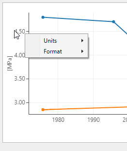
Use the context menu to change the units and the format click to enlarge
Zooming - In the plot area, left mouse button click and keep pressed down to activate zooming. You can move your mouse in any direction. A preview window indicates the new display window. When you let go of the left mouse button, this is the part of the chart that is shown. To zoom out, double click in the chart area.
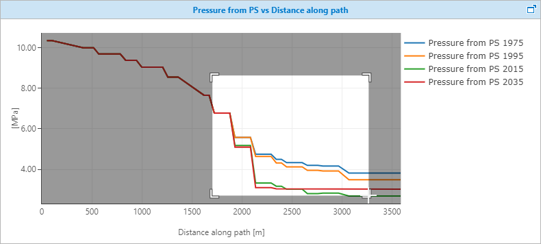
A preview window highlights the new display window click to enlarge
Scroll axis relative to other axis - Hover over the vertical or horizontal axis with your mouse until the tool tip changes into a bidirectional arrow. Left mouse button click and keep pressed down while moving the mouse will scroll the selected axis relative to the other axis.
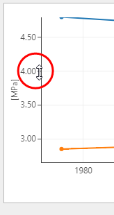
Adjust the values along the axis with the mouse tooltip changed into a bidirectional arrow click to enlarge
Show/hide legend - A right mouse button click in the chart area opens a context menu with the Show/hide legend option. When the legend is shown, you can also use it as a display filter: when you click on a name, that data is hidden from the chart, and the legend is grayed out.
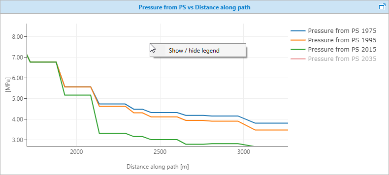
Using the legend as a display filter click to enlarge